Components that have a visual presentation have a number of options on how to display the view. There are two main options: showing xaml user controls, or UI generation based on view models. Showing xaml user controls is more appropriate for advanced UI's, where the autogenerated is more useful for simpler data input UI's or for developer with less silverlight skill. Components can also show messages and errors to the user. The is responsible for all of the layout rendering is FDOT.GIS.Client.Domain.LayoutManager. All views are displayed in a floatable window.
DialogServiceArgs
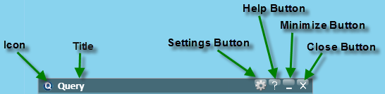
The location of the buttons is titlebar of the floatablewindow
Many of the methods to show a view contain a parameter for FDOT.GIS.Client.Domain.DialogServiceArgs. These options control how the floatable window will be displayed
| Name | Type | Description |
|---|
| BackContent | FrameworkElement | Allows the components to display a second view on the back side of the view. |
| CanResize | bool | Sets if the floatable window can be resized. |
| HasCloseButton | bool | Sets if the floatable window has a close button. |
| HasMinimizeButton | bool | Sets if the floatable window has a minimize button. |
| HasSettingsButton | bool | Sets if the floatable window has a settings button |
| Height | double? | Sets the height of the floatable window. |
| HelpId | string |
| Icon | BitmapImage | The icon that is used in the upper left corner of the floatable window. |
| Id | string | The identifier used to reference the window |
| IsModal | bool | Sets if the floatable is Modal. |
| SettingsViewModel | object | Sets the view model that will be used to generator a settings panel. |
| ShowSettingsOnBack | bool |
| Title | string | The title that is shown in the floatable window. |
| Width | double? | The width of the floatable window. |
Example
var dialog args=new DialogServiceArgs
{
  Id = "Sample",
  Title = "Sample Component Title",
  HelpId = "tools;" + GetType().FullName,
  Icon = Icon,
  ShowSettingsOnBack = true,
  SettingsViewModel = SettingsViewModel,
  HasCloseButton = true,
  HasMinimize = false
}
GenericViewDialog
Both ShowPanel and ShowViewModel both return a FDOT.GIS.Client.ViewModel.GenericDialogViewModel for manipulation of the window. The GenericViewDialogViewModel allows the developer to programmatically close a window and has events to subscribe to for when dialog is closed.
Properties
| Name | Type | IsSettable | Description |
|---|
| Args | DialogServiceArgs | true |
| BackContent | FrameworkElement | true | The view that is presented on the back of the view. |
| Content | FrameworkElement | true | This is the view used on the front of the floatable window. |
| DisableFlipOnPanelClick | bool | false | Returns if the flip for back content is disabled. |
| HasBackContent | bool | false | Returns if the floatable window has back content. |
| HelpId | string | true |
| ShowHelpCommand | ICommand | false |
| ShowHelpLink | bool | false | Returns if the help link is visible. |
| ShowSettingsButton | bool | false | Returns if the setting button is visible. |
| ShowSettingsCommand | ICommand | false |
| VisibleContent | FrameworkElement | true | Returns the currently visible content. |
Methods
| Name | Return Type | Description |
|---|
| AttachView(object view,object context) | void |
| Close() | void | Closes the floatable window. |
| ShowSettingsDialog() | void | Shows the settings viewModel. |
| ToggleVisibleContent() | void | Toggles between the content and backcontent. |
Events
| Name | Description |
|---|
| Closed | Allows the component handle certain cleanup actions when the dialog closes |
ShowViewModel
LayoutManager.ShowViewModel generates a view based on the viewModel. This allows components to be built very quickly without having to design xaml user controls. There are 7 overloads for the ShowViewModel method.
GenericDialogViewModel ShowViewModel(IComponentBase parentViewModel, object childViewModel, Action<ErrorEventArgs> errorHandler)

GenericDialogViewModel ShowViewModel(object viewModel, string id)

GenericDialogViewModel ShowViewModel(object viewModel, DialogServiceArgs args)GenericDialogViewModel ShowViewModel(object viewModel, DialogServiceArgs args, Action<ErrorEventArgs> errorHandler)

GenericDialogViewModel ShowViewModel(IComponentBase viewModel)

GenericDialogViewModel ShowViewModel(IComponentBase viewModel, DialogServiceArgs args)

GenericDialogViewModel ShowViewModel(IComponentBase viewModel, DialogServiceArgs args, Action<ErrorEventArgs> errorHandler)
There are a number of the attributes that can be set on the on properties to specify how the view should be generated. For more about how these attributes see
Generated View Attributes.
ShowPanel
The ShowPanel allows custom user controls to be displayed to the users. This is can be used to display complicated layouts that can not be autogenerated from the ShowViewModel method.
Xaml Example
<UserControl x:Class="FDOT.GIS.Client.Components.Views.DrawToolView"
    xmlns="http://schemas.microsoft.com/winfx/2006/xaml/presentation"
    xmlns:x="http://schemas.microsoft.com/winfx/2006/xaml"
    xmlns:d="http://schemas.microsoft.com/expression/blend/2008"
    xmlns:mc="http://schemas.openxmlformats.org/markup-compatibility/2006"
    xmlns:ed="clr-namespace:Microsoft.Expression.Shapes;assembly=Microsoft.Expression.Drawing"
    xmlns:sdk="clr-namespace:System.Windows.Controls;assembly=System.Windows.Controls.Data.Input"
    mc:Ignorable="d"
    xmlns:Converters="clr-namespace:FDOT.GIS.Client.Converters;assembly=FDOT.GIS.Client"
    xmlns:controls="clr-namespace:FDOT.GIS.Client.Controls;assembly=FDOT.GIS.Client"
    xmlns:cal="clr-namespace:Caliburn.Micro;assembly=Caliburn.Micro">
    <Grid x:Name="LayoutRoot">
        <Grid.RowDefinitions>
            <RowDefinition Height="Auto"/>
            <RowDefinition Height="Auto"/>
            <RowDefinition Height="Auto"/>
            <RowDefinition Height="Auto"/>
        </Grid.RowDefinitions>
        <Grid.ColumnDefinitions>
            <ColumnDefinition Width="Auto"/>
            <ColumnDefinition Width="Auto"/>
            <ColumnDefinition Width="*"/>
        </Grid.ColumnDefinitions>

        <sdk:Label Grid.Row="0" Grid.Column="0" Content="Draw Color" VerticalAlignment="Center" />
        <StackPanel Grid.Row="0" Grid.Column="1" Grid.ColumnSpan="2" MinWidth="260" MinHeight="20" Margin="0,0,0,5">
            <controls:ColorSlider cal:Message.Attach="[Event ColorChanged]=[Action DrawColorChanged($eventArgs)];" HexColor="{Binding CurrentDrawColor, Mode=TwoWay}" />
        </StackPanel>

        <sdk:Label Grid.Row="1" Grid.Column="0" Content="Draw Type" VerticalAlignment="Center" />
        <StackPanel Grid.Row="1" Grid.Column="1" Grid.ColumnSpan="2" Orientation="Horizontal">
            <controls:ShapeSelector cal:Message.Attach="[Event ShapeSelected]=[Action Draw($eventArgs)];" />
        </StackPanel>

        <sdk:Label Grid.Row="2" Grid.Column="0" Content="Show Labels" VerticalAlignment="Center" />
        <controls:SwitchButton Grid.Row="2" Grid.Column="1" IsChecked="{Binding ShowLabels, Mode=TwoWay}" />

        <Button Grid.Row="3" Grid.Column="1" Margin="5" Content="Clear" cal:Message.Attach="[Event Click]=[Action Clear()];" />
    </Grid>
</UserControl>
ShowPanel Example
_dialogViewModel = LayoutManager.Instance.ShowPanel(drawView,
      new DialogServiceArgs
      {
          Title = this.ComponentConfiguration.Name,
          HelpId = "tools;" + GetType().FullName,
          Icon = Icon
      });
ShowMessage
Message Example
The ShowMessage method allows messages to be displayed to the user. Messages can be shown with a variety of options and return a MessageViewModel to allow the updates of progress. There are three ShowMessage overloads.
ShowMessage(string message)
Allows the user to show a message without an expiration timeout. Returns a MessageViewModel.
Example
var messageViewModel = LayoutManager.Instance.ShowMessage("Example");ShowMessage(string message,Timespan expireTimespan)
Allows the user to show a message without an expiration timeout. Returns a MessageViewModel.
Example
var messageViewModel=LayoutManager.Instance.ShowMessage("Example", new TimeSpan(0, 0, 10));ShowMessage(MessageViewModel message, TimeSpan timeSpan)
Example
var message = new MessageViewModel { ShowProgress = true, Message = "Executing Identify" };
LayoutManager.Instance.ShowMessage(message, TimeSpan.Zero);
MessageViewModel

Example of Message with Progressbar
The messageViewModel object can be used to customize the message shown more with progess bars. It is also passed into the LayoutManager.RemoveMessage method to remove an existing message.
Properties
| Name | Type | Description |
|---|
| IsProgressIndeterminate | bool | Sets if the progress bar is indeterminate |
| Message | string | The message shown in the message box. |
| Progress | int? | An int of 0-100 to show the current progress |
| ShowProgress | bool | Determines if the progress bar is shown. |
See Also